How to Check If Your St. George, Utah Business Website Is Mobile-Friendly
If you run a business in St. George, Utah, your website needs to work perfectly on a phone. More than 60 percent of all web searches now happen on mobile devices, and Google uses your site’s mobile version first when deciding where you rank in search results. That policy, called mobile-first indexing, means a site that looks broken on a phone will lose ground to competitors in Washington County and across Southern Utah whether the desktop version is flawless or not. The good news is that checking your mobile-friendliness takes less than five minutes using free tools that anyone can use, no technical background required. This guide walks you through exactly how to test your site, what the results mean, and what to do when you find problems.
Why Mobile-Friendliness Matters for St. George Businesses
St. George is one of the fastest-growing cities in Utah. New residents arrive constantly, tourists visit year-round for Zion National Park and Snow Canyon, and locals use their phones to find everything from plumbers in Hurricane to restaurants in Ivins. If your website does not load cleanly on a phone, those potential customers bounce back to Google and click your competitor instead.
Google officially switched to mobile-first indexing for all sites years ago. That means the Googlebot that crawls your site behaves like a smartphone user, not a desktop user. If your mobile site has missing content, slow load times, or tiny buttons, Google sees those problems and ranks you lower accordingly.
For small businesses in Washington County competing for local search visibility, a poor mobile experience is not just a user experience problem. It is a direct ranking penalty. Understanding what technical SEO actually is helps you see why mobile performance sits at the very foundation of your search rankings.
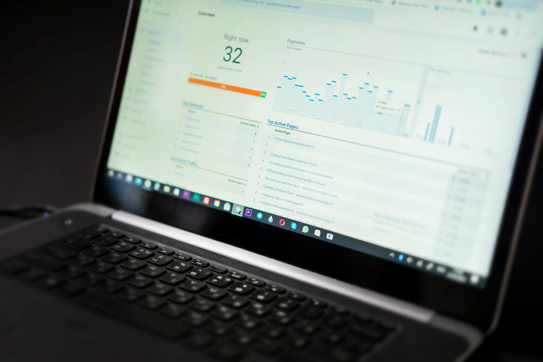
How to Use Google’s Mobile-Friendly Test
Google offers a free tool that gives you an instant mobile-friendliness verdict for any URL. Here is how to use it in three steps.
Step 1: Run the Test
Go to search.google.com/test/mobile-friendly in your browser. Type or paste your business website’s URL into the field and click “Test URL.” The tool will crawl your page and return results in about 30 seconds.
Step 2: Read the Results
You will see one of two outcomes: “Page is mobile friendly” with a green checkmark, or a notice that the page has usability issues. If problems are found, the tool lists them below the verdict. Common issues include text that is too small to read, clickable elements placed too close together, and content that is wider than the screen.
Step 3: Understand the Limitations
This tool only tests one URL at a time. If your homepage passes but your service pages or blog posts have problems, you will not catch that here. Run the test on your most important pages, including your homepage, your main service page, and any page you actively promote in ads or social media.
Check Mobile Performance with PageSpeed Insights
Passing the mobile-friendly test does not mean your mobile site is fast. Speed is a separate but equally important factor. Google’s PageSpeed Insights tool measures how quickly your pages load on a mobile connection and gives you a score from 0 to 100.
Go to pagespeed.web.dev, enter your URL, and wait for the report. The tool splits results into two tabs: Mobile and Desktop. Always check the Mobile tab first because that is what Google prioritizes. A score above 90 is excellent, 50 to 89 is average and needs work, and anything below 50 will noticeably hurt your rankings and user experience.
The report also shows you specific issues sorted by impact. Items marked “Opportunities” can directly improve your load time if fixed. Items under “Diagnostics” are additional details that help your developer understand what is happening under the hood. You do not need to understand every technical detail, but sharing this report with whoever manages your website gives them a clear action list.
Use Google Search Console for Real-World Mobile Data
Google Search Console is the most authoritative source of mobile data for your specific site because it reports on what Google’s own crawlers have actually experienced, not just a single test snapshot. If you have not claimed and verified your site in Search Console, that should be your first priority.
Finding Mobile Usability Issues
Once inside Search Console, look for “Mobile Usability” under the “Experience” section in the left sidebar. This report shows you every page on your site that has a mobile usability error and how many pages are affected. Unlike the single-URL tool, this gives you a sitewide view so nothing slips through.
Reading the Core Web Vitals Report
Search Console also has a Core Web Vitals section that shows Mobile and Desktop scores separately. Pages marked “Poor” or “Needs Improvement” on mobile are actively being ranked lower in Google results. Our detailed guide on what Core Web Vitals are and why they affect your rankings explains each metric in plain language so you know what you are looking at.
The Manual Phone Test You Should Never Skip
Automated tools are useful, but they cannot replace actually picking up your phone and browsing your own website. Pull up your site on your personal smartphone and ask yourself these questions as you click through it.
- Does the page load within 3 seconds on a standard cellular connection, not just your fast office Wi-Fi?
- Can you read all the text without pinching and zooming?
- Do buttons and menu items have enough space around them that you can tap them without hitting the wrong one?
- Does your phone number appear as a clickable link that opens the dialer automatically?
- Do forms, like contact forms or quote request forms, work properly on a touchscreen keyboard?
- Do images load, or do some fail entirely?
If you find yourself frustrated using your own site on mobile, your customers feel the same way and they leave. Ask a friend or family member to browse your site on their phone too. Fresh eyes catch things you miss because you are too familiar with your own content.
Common Mobile Problems Found on Southern Utah Business Sites
After working with businesses across Cedar City, Washington, Santa Clara, and St. George, certain mobile problems come up again and again. Knowing these in advance helps you spot them faster on your own site.
Unresponsive Website Design
A responsive website automatically adjusts its layout to fit whatever screen size is viewing it. Many older sites in Southern Utah were built before responsive design became standard and have never been updated. These sites show desktop layouts squeezed onto phone screens, making text and buttons impossibly small.
Slow Image Loading
Large, uncompressed images are one of the biggest causes of slow mobile load times. A high-resolution photo that looks beautiful on a desktop can take five to ten seconds to load on a mobile connection, and most users will leave before it finishes. Images should be compressed and served in modern formats like WebP whenever possible.
Popups That Block the Screen
Google penalizes mobile pages that use large popups, called interstitials, that cover the main content shortly after the page loads. If you have a newsletter signup or promotional popup, make sure it does not cover the full screen on mobile devices.
Tiny Tap Targets
Google recommends that clickable buttons and links be at least 48 by 48 pixels with adequate spacing between them. Navigation menus with tightly packed links are a common culprit. When links are too close together, users tap the wrong one and quickly get annoyed.
Ready to Grow Your St. George Business?
Timpson Marketing builds SEO, PPC, social media, and web design strategies that drive real results for Southern Utah businesses.
How Core Web Vitals Connect to Mobile SEO
Core Web Vitals are a set of three specific performance measurements that Google uses as ranking signals. They measure how fast your largest piece of content loads (Largest Contentful Paint), how quickly your page responds to the first user interaction (Interaction to Next Paint), and how stable your layout is as the page loads (Cumulative Layout Shift).
All three metrics are measured separately for mobile and desktop. Because Google indexes the mobile version of your site first, your mobile Core Web Vitals scores carry significant weight. A page that shifts around while loading, takes too long to respond to a tap, or loads its main image slowly will score poorly and rank lower than a page that does those things well.
Understanding these metrics in depth helps you have more productive conversations with your web developer or designer. Our post on understanding Core Web Vitals for your business website breaks down each one without drowning you in developer jargon.
How to Fix a Website That Fails the Mobile Test
If your tests reveal problems, here is a practical path forward based on what is actually wrong.
If Your Site Is Not Responsive
A non-responsive site usually requires a rebuild or a significant theme change rather than a simple patch. If your site runs on WordPress, switching to a modern responsive theme is often the fastest solution. If you have a custom-built site, your developer will need to rewrite the CSS to be responsive. This is worth the investment because it resolves nearly every layout-related mobile issue at once.
If Your Site Is Slow on Mobile
Start with images: compress every image on your site using a tool like Squoosh or a WordPress plugin like Imagify. Next, check whether your hosting plan is adequate. Budget shared hosting is a common bottleneck for Southern Utah small business sites. Enabling browser caching and minimizing unused JavaScript are also high-impact steps your developer can take from the PageSpeed Insights report.
If You Have Specific Usability Errors
Search Console will tell you exactly which pages have which errors. Clickable element spacing issues can often be fixed with small CSS adjustments. Viewport configuration errors usually require a single line of code added to the site header. These are typically quick fixes for a developer who knows what they are looking at.
Mobile-First Indexing and Your Local St. George SEO
When someone in St. George searches for a service near them, Google returns a Local Pack, which is the map block with three business listings, followed by organic results. Both the Local Pack ranking and the organic results below it are influenced by your website’s quality, including its mobile experience.
A business in Hurricane or Washington City with a fast, clean mobile site will outrank a competitor with a better offline reputation but a broken mobile presence. Google’s local ranking algorithm weighs proximity, relevance, and prominence. Your website’s technical quality feeds directly into the prominence signal.
Mobile-friendly design also reduces your bounce rate, meaning more visitors stay on your site longer. Lower bounce rates tell Google that your site is relevant and useful, which feeds back into your rankings over time. The relationship between mobile experience and local SEO is not a one-time checkbox. It is an ongoing factor that compounds over months and years.
Frequently Asked Questions
What is the easiest way to check if my website is mobile-friendly?
The easiest starting point is Google’s Mobile-Friendly Test, available at search.google.com/test/mobile-friendly. You paste your URL into the tool and it returns a verdict within 30 seconds along with a list of any issues it finds. This test is completely free and requires no login or account. For a more comprehensive view, follow up with Google Search Console, which shows mobile usability issues across your entire site rather than just one page at a time.
Does a mobile-friendly website actually affect my Google rankings in St. George?
Yes, directly and significantly. Google switched to mobile-first indexing, which means the Googlebot evaluates and indexes your site based on how it performs on mobile devices. If your mobile experience is poor, your rankings in St. George and Southern Utah search results will reflect that regardless of how well-built your desktop site is. A fast, clean mobile experience is one of the foundational technical SEO requirements for ranking competitively in any local market.
What is the difference between a mobile-friendly test and a mobile speed test?
A mobile-friendly test checks whether your site is structured and formatted in a way that works on small screens. It looks at things like text size, tap target size, and whether the page uses a responsive design layout. A mobile speed test measures how quickly your page loads on a mobile device and connection. Both matter for SEO and user experience, but they measure different things. You need to pass both to have a site that ranks well and keeps visitors engaged.
How do I check mobile performance for free without a developer?
Google PageSpeed Insights at pagespeed.web.dev gives you a detailed mobile performance report at no cost. You do not need a Google account or any technical knowledge to run the test. The report breaks down issues into categories and explains what each problem means in relatively plain language. You can share the report directly with your web developer or agency and ask them to address the items listed under “Opportunities” first since those have the largest direct impact on load time.
What score should my website get on PageSpeed Insights for mobile?
A score of 90 or above on the mobile tab is considered good and puts you in a strong competitive position. Scores between 50 and 89 indicate room for improvement and may mean you


Leave A Comment